File:Land mine casualties and fatalities.png
 From Wikipedia the free encyclopedia
Size of this preview: 800 × 351 pixels. Other resolutions: 320 × 140 pixels | 640 × 281 pixels | 1,425 × 625 pixels.
Original file (1,425 × 625 pixels, file size: 33 KB, MIME type: image/png)
| This is a file from the Wikimedia Commons. Information from its description page there is shown below. Commons is a freely licensed media file repository. You can help. |
Summary
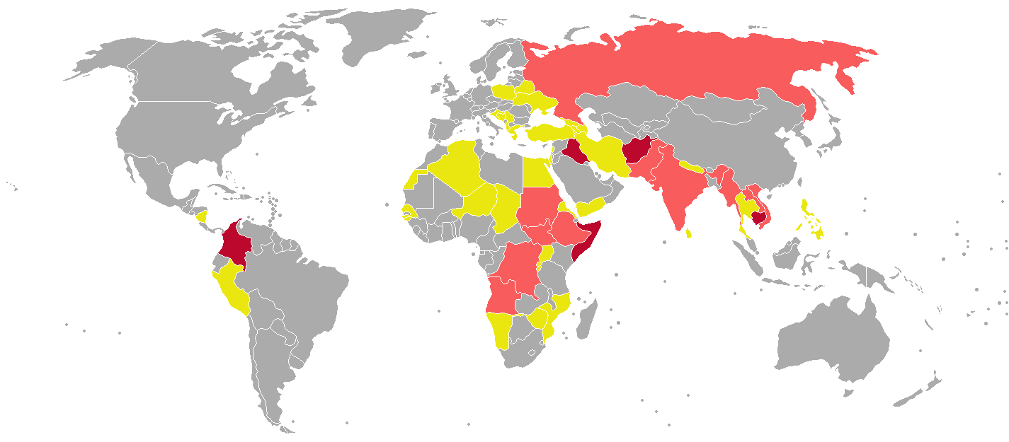
| Description | English: A schematic showing the countries with more than 100 victims of landmines recorded between 1999 and 2010. The map uses data from International Campaign To Ban Landmines - Cluster Munition Coalition . It was made based on the map shown in National geographic magazine january 2012, see http://ngm.nationalgeographic.com/2012/01/landmines/jenkins-text
|
| Date | |
| Source | Own work |
| Author | KVDP |
Licensing
I, the copyright holder of this work, hereby publish it under the following license:
This file is licensed under the Creative Commons Attribution-Share Alike 3.0 Unported license.
- You are free:
- to share – to copy, distribute and transmit the work
- to remix – to adapt the work
- Under the following conditions:
- attribution – You must give appropriate credit, provide a link to the license, and indicate if changes were made. You may do so in any reasonable manner, but not in any way that suggests the licensor endorses you or your use.
- share alike – If you remix, transform, or build upon the material, you must distribute your contributions under the same or compatible license as the original.
File history
Click on a date/time to view the file as it appeared at that time.
| Date/Time | Thumbnail | Dimensions | User | Comment | |
|---|---|---|---|---|---|
| current | 10:05, 9 February 2012 | | 1,425 × 625 (33 KB) | Genetics4good |
File usage
No pages on the English Wikipedia use this file (pages on other projects are not listed).
Global file usage
The following other wikis use this file: